
The short version
- A page converts when a visitor can tell within a few seconds what you offer, whether it’s for them and what to do next.
- Design for the phone first. Check your own device split in GA4; on many small business and ecommerce sites, phones bring most of the visits.
- Speed, visible prices and proof, and a short enquiry form or checkout usually do more for sales than new features.
- Only A/B test when you have enough conversions to get a clear answer. Otherwise, watch session recordings and ask customers what nearly stopped them.
- Judge every change by the enquiries and sales each page brings in.
Website design for conversions comes down to one question: can a visitor on a phone work out what you sell, decide they trust you and take the next step without anything slowing them down? Each principle below is a way of making the answer yes.
The principles apply whether your site sells products or brings in enquiries. Where a point only applies to online shops, it says so.
Decide what each page should get people to do
Before changing layouts or colours, write down the one action each important page exists for. A service page wants an enquiry or a call. A product page wants an add to basket. A homepage mostly needs to send people to the right service or category quickly. Some pages have a second action, such as an email sign-up, but one should clearly lead.
Then get a baseline. In GA4, set up enquiries, bookings, clicks on your phone number and purchases as conversions, and look at the conversion rate for each landing page over the last three months.
Example: if a service page had 1,200 visits last quarter and 18 enquiries, it converts at 1.5%. That’s the number your design changes need to move.
Compare against your own figures month on month rather than “average conversion rate” claims found online, which lump very different sites together.
Make the first screen do its job
The part of the page people see before they scroll should tell them what this is, who it’s for and what to do next.
- A headline that says what you do in plain words. “Kitchen fitting in Swindon and Wiltshire” tells people more than “Crafting spaces you’ll love”.
- A line underneath giving a reason to choose you: a guarantee, a turnaround time, a starting price, the area you cover.
- One main button. If there’s a second, make it look secondary.
- A real image of your work, your product or your premises. Stock photos of people shaking hands tell nobody anything.
Rotating sliders usually work against this: few visitors wait for slide three, and the extra images slow the page. One strong image and a clear headline do the job better.
UX design principles and best practices
UX (user experience) design is about how easy the site is to use. UI (user interface) is the visual layer: buttons, type, spacing and colour. These are the UX principles that make the most difference to conversions on a small business or ecommerce site.
Use the conventions people already know
Logo top left and linking to the homepage, menu along the top (or behind a menu icon on mobile), basket top right, search where people expect it. Every unfamiliar pattern makes someone stop and think. Within the site, keep the same button style for the same kind of action and the same layout for every product or service page, so people learn it once.
Make the important things look important
The thing you most want people to read or click should be bigger, higher up or higher in contrast than everything around it. If everything is bold, nothing stands out. Use headings that describe each section, because most visitors scan a page before they decide to read it.
Cut choices and steps
Every extra menu item, form field and checkout step is another place where someone can give up. Remove what isn’t earning its place, and group long menus into a few clear categories.
Tell people what’s happening
Confirm every add to basket and form submission straight away. Show form errors next to the field, keep what’s already been typed, and say how to fix it.
Make it accessible
Body text should meet the WCAG AA contrast ratio of 4.5:1 against its background. Images need alt text, every action should work with a keyboard, and form fields need visible labels rather than placeholder text that disappears when you start typing. Most of these fixes make the site easier for everyone, including someone reading a phone in bright sunlight, and they reduce your risk under the Equality Act 2010.
Mobile optimisation for ecommerce and service sites
Google mainly uses the mobile version of your site when it decides rankings, which it calls mobile-first indexing. Check how your own visitors and buyers split between phones and desktops in GA4’s Tech overview report; some businesses find people browse on a phone and buy on a laptop. For online shops, our guide to mobile optimisation for ecommerce goes further.
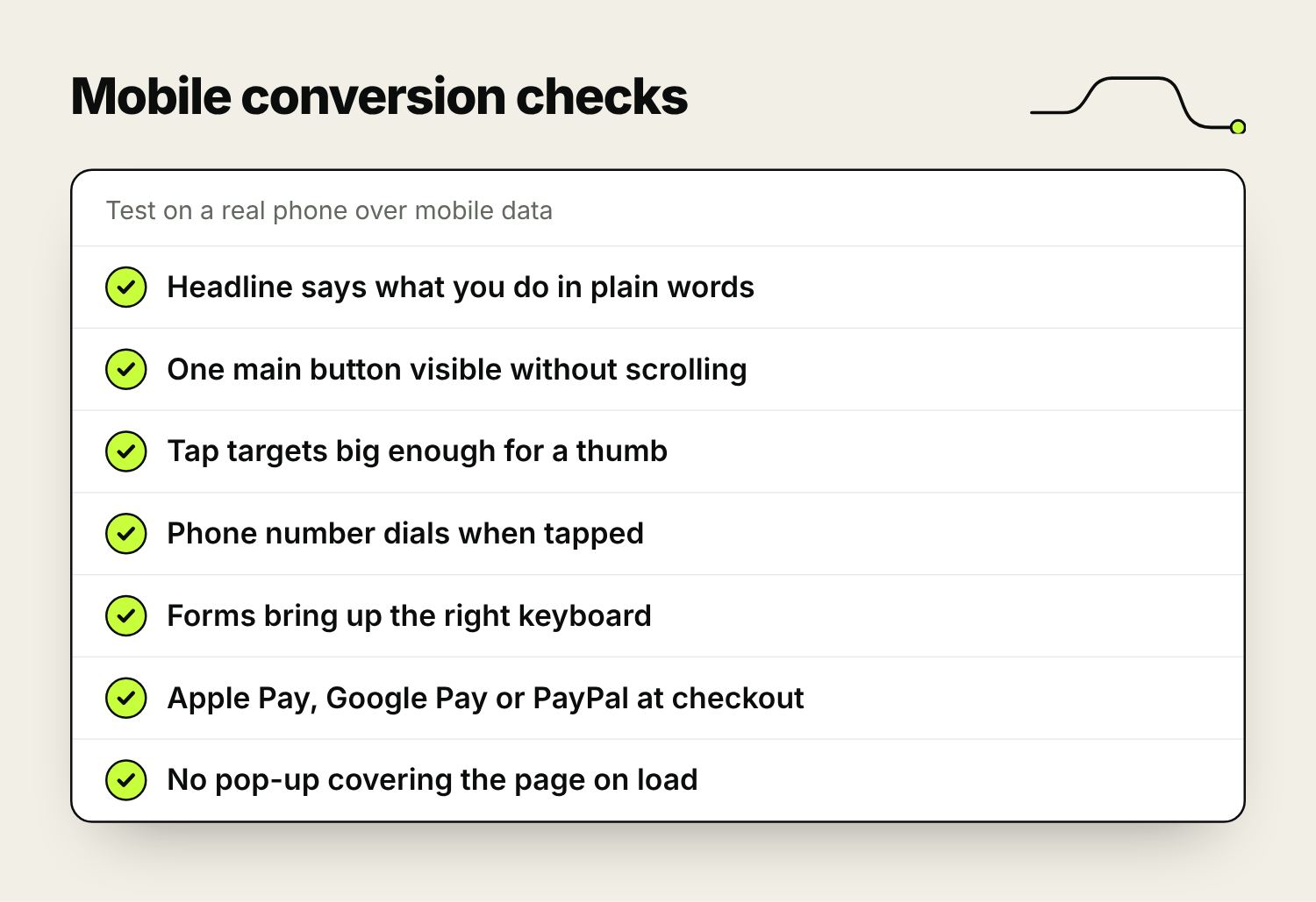
The checks that matter most on a phone:
- Buttons and links big enough for a thumb. Apple’s design guidelines suggest tap targets of at least 44 by 44 points, and Google’s suggest 48 by 48.
- Body text you can read without zooming. 16px is a sensible minimum.
- On product pages, an add-to-basket bar that stays on screen once the main button has scrolled out of view.
- Phone numbers that dial when tapped, and addresses that open in a maps app.
- Form fields that bring up the right keyboard: a number pad for phone numbers and the @ key for email addresses. Setting the field type to “tel” or “email” does this.
- Express payment options at checkout, such as Apple Pay, Google Pay and PayPal, so nobody has to type a card number and address on a small screen.
- Collection filters that work with one hand and show how many products match before you apply them.
- No pop-up covering the page the moment it loads. Google has said intrusive pop-ups can affect mobile rankings, and they put people off.
Test on a real mid-range Android phone over mobile data as well as on a new iPhone on the office wifi. That’s closer to how many of your customers will see the site.
Page speed: what to fix first
Slow pages lose people before they’ve seen anything. Google measures real visitors’ experience with its Core Web Vitals, and its “good” thresholds make sensible targets: the main content should appear within 2.5 seconds (Largest Contentful Paint), the page should respond to a tap within 200 milliseconds (Interaction to Next Paint), and the layout shouldn’t jump about as it loads (Cumulative Layout Shift under 0.1).
Run your main pages through Google’s free PageSpeed Insights tool and look at the mobile results. These are the usual causes of a slow small business site, roughly in the order worth tackling:
| Problem | Typical fix |
|---|---|
| Large images uploaded straight from a camera or phone | Resize to the size they’re shown at, compress them, use WebP or AVIF, and lazy-load images further down the page |
| Plugins and apps you no longer use | Remove them. Each one can add code to every page. |
| Chat, review and tracking scripts loading straight away | Delay them until the page has loaded, and remove any nobody uses |
| Sliders, background video and heavy animation | Replace with a single, well-compressed image |
| Cheap shared hosting | Better hosting with caching and a content delivery network (CDN) |
Calls to action that get clicked
A call to action should say what happens when someone clicks. “Get a quote”, “Book a free survey”, “Add to basket” and “Check availability” all do. “Submit”, “Learn more” and “Click here” don’t. Match the wording to how ready the visitor is: someone reading a guide may want “See prices” before they’re ready for “Book a call”.
No button colour works best everywhere. What matters is contrast: your main button should be the most noticeable thing in its section, in a colour you don’t use for anything else. Put it at the top for people who already know what they want, and again after the detail and proof for people who needed convincing. On long pages, repeat it.
Make what happens after the click easy too. A form asking for a name, a phone number or email address and a message will usually get more enquiries than one with a dozen required fields. You can ask the rest on the call.
Give people reasons to trust you
People won’t buy or enquire if something feels off. Trust is built from specific details:
- Reviews from real customers, ideally from Google or an independent review platform, shown near the button as well as on a testimonials page.
- Prices, or at least a starting price or typical range. When prices are hidden, people tend to assume the worst.
- Delivery costs, delivery times and the returns policy next to the add-to-basket button, where people look for them. Costs that only appear at checkout are a common reason people abandon a basket.
- A real address and phone number, the names and faces of the people customers will deal with, and photos of your own work and premises.
Be careful with urgency. Genuine low-stock messages and real sale end dates help people decide. Fake countdown timers and invented “only 2 left” warnings can breach UK consumer protection law, and customers learn to spot them.
Product pages and checkout
On an online shop, the product page and the checkout do most of the converting. A product page should have:
- Several photos from different angles, close-ups of the detail, and the product in use. Add video where people need to judge size or movement.
- A description that answers the questions customers email you about: size, materials, compatibility, care, what’s in the box.
- Clear stock and delivery information.
- Reviews, with a way to filter them.
- Related or “goes with” products. Most ecommerce platforms can do this without custom work.
In the checkout, allow guest checkout and offer an account after the order rather than before it. Show the full cost, including delivery, as early as you can. Keep fields to what you need and use postcode address lookup. Offer the payment methods your customers use, and strip the header back so people aren’t pulled into browsing again.
Check your site search too. Look at what people search for in your shop (your platform or GA4 can report it) and fix any common search that returns nothing. For the search engine side of product and category pages, see our guide to SEO for ecommerce websites.
Interactive features and design trends: which are worth it
Each year brings a new list of ecommerce design trends, from AR and AI chatbots to quizzes and gamified discounts. Some help the right shop, but most small sites get more from fixing the basics above first.
| Feature | Worth it when | Skip it when |
|---|---|---|
| Live chat | Someone can reply within a minute or two during opening hours | Nobody is watching it and it only collects messages a form could take |
| AI chatbot | You have a large catalogue or lots of repeat questions, and you’ve tested its answers | It might guess at prices, stock or policies |
| Product finder quiz | Your range is hard to choose from, such as skincare, bikes or mattresses | You sell a handful of simple products |
| 360° views and video | Size, texture or movement is what people are unsure about | Good photos already answer the question |
| AR “see it in your room” | Furniture, homeware or eyewear, where scale or fit is the doubt | It needs building from scratch for a small range |
| Personalised recommendations | Your platform includes them and you have enough orders for them to work from | They need custom development |
| Spin-to-win and other games | Rarely | You sell at a premium price |
Before adding anything, write down the problem it solves for the customer and how you’ll measure whether it worked.
A/B testing and conversion rate optimisation
A/B testing (or split testing) shows two versions of a page or email to different visitors over the same period and measures which gets more conversions. Because both versions run at the same time, season and ad spend affect them equally.
The catch is traffic. Each version needs enough conversions for the result to mean anything, and a small site can take months to collect them. Before you start, put your current conversion rate and the improvement you hope to see into an online A/B test sample size calculator. If it says the test would need to run for more than a couple of months, don’t run it.
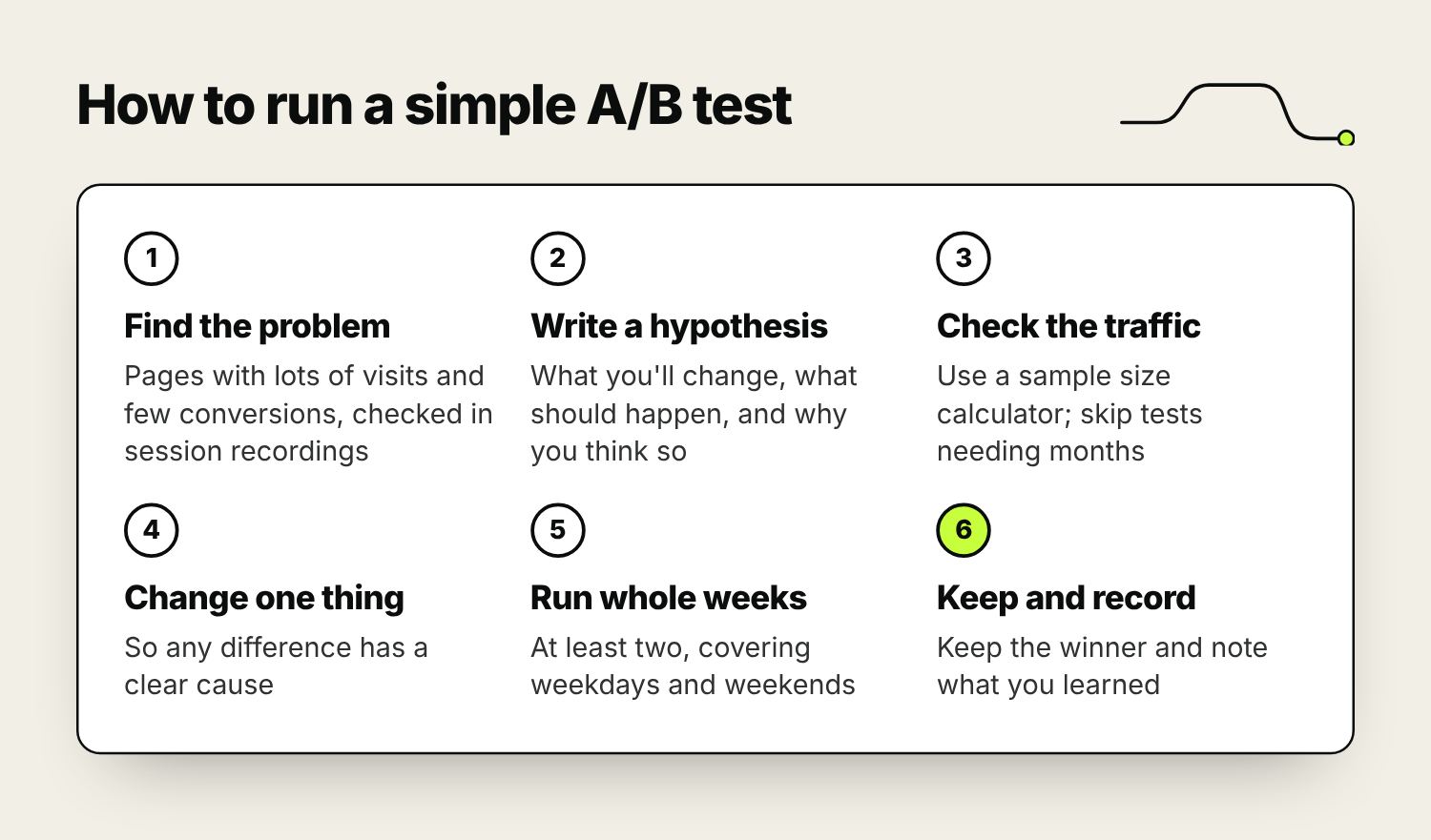
When you do have the traffic:
- Find the problem. Use GA4 to spot pages with plenty of visits and few conversions, then watch session recordings (Microsoft Clarity is free) to see where people hesitate or leave.
- Write a hypothesis, for example: “Showing delivery costs above the add-to-basket button will reduce basket abandonment, because recordings show people leaving to check the delivery page.”
- Change one thing, so you know what caused any difference.
- Run the test for whole weeks, at least two, so weekdays and weekends are both covered. Don’t stop it the moment one version pulls ahead.
- Keep the winner, write down what you learned, and test the next idea.
Email is an easier place to start: most email platforms can test two subject lines on part of your list and send the winner to the rest.
Without the traffic for formal tests, watch 20 or 30 recordings of visits that didn’t convert, ask a few people who match your customers to try a task on the site while talking it through, and email recent customers one question: what nearly stopped you buying? Then make the change and compare before and after, allowing for anything else that changed at the same time.
Questions to ask your web designer or developer
These questions show quickly whether the people building your site think about conversions:
- How will enquiries and sales be tracked in GA4 from launch day?
- Will the site be designed for mobile first, and can I see the designs on a phone before it’s built?
- What Core Web Vitals scores do your recent sites get on mobile, and can I check one?
- How will you keep our existing Google rankings? Is there a redirect plan for every old page address?
- Who owns the domain, hosting, design files and content when the project ends?
- Can I edit pages and products myself without breaking the layout?
- How do you handle accessibility?
- What happens after launch: updates, security, backups, and who fixes things when they break?
If you’re also choosing a platform, see our comparison of the best ecommerce platforms for SEO. Our website design page explains how we plan sites around conversions.
Frequently asked questions
What are the most important website design principles for conversions?
Make it obvious in the first screen what you offer and who it’s for. Design for mobile first, keep pages fast, and use calls to action that say what happens next. Show prices, reviews and delivery details near the decision, and remove any step from forms and checkout that you don’t need.
How do I optimise an ecommerce site for mobile?
Use large tap targets and readable text, keep the add-to-basket button in reach, offer express payments such as Apple Pay and Google Pay, make filters easy to use with one hand, and avoid pop-ups that cover the page. Then test on a mid-range Android phone over mobile data.
What is a good website conversion rate?
It varies too much by industry, price and where visitors come from for one figure to be useful. Track your own conversion rate by page and by channel in GA4, and aim to improve it over time.
Do I have enough traffic for A/B testing?
Put your current conversion rate into an A/B test sample size calculator. If the test would need more than a couple of months, use session recordings, quick user tests and customer surveys instead, and compare results before and after each change.
Does website design affect SEO?
Yes. Google mainly uses the mobile version of your site, takes page experience into account, and relies on clear headings and structure to understand each page. A site that’s fast, easy to use on a phone and clearly organised tends to do better in search.
What should I ask a web developer before hiring them?
Ask how conversions will be tracked, whether they design for mobile first, what speed scores their recent sites get, how they’ll protect your existing rankings with redirects, who will own the site and its content, and what support you get after launch.

Founder of The Pursuit Agency in Swindon. He has worked in SEO for fifteen-odd years and leads the agency's SEO and Google Ads work for owner-led businesses across the UK.