
The short version
- Compare each step of your funnel by device in GA4 before changing anything. The step where phones fall furthest behind desktops is where to start.
- On a phone, the product page has to answer size, delivery and returns questions without sending people off to another page.
- Wallet payments such as Apple Pay and Google Pay help most when they appear on the product page and basket as well as at checkout.
- Test on real phones over mobile data, including inside the Instagram and Facebook in-app browsers where social traffic lands.
Ecommerce mobile optimisation is the work of making it as easy to find, choose and pay for a product on a phone as it is on a laptop. The basics, such as tap targets, readable text and Google’s speed targets, are in our guide to website design principles for conversions. This guide is for shops that have those covered and still find phone visitors buy less.
Find where phones are losing sales
Some gap between mobile and desktop is normal, because people often research on a phone and buy later on a laptop. Shopping on a phone only took off after the iPhone arrived in 2007, which our short history of online shopping covers. What you’re looking for is a step in the journey where phones fall much further behind than everywhere else.
In GA4, open Explore and build a funnel exploration with four steps: view_item, add_to_cart, begin_checkout and purchase. Break it down by device category. You’ll see the share of people who make it from each step to the next, side by side for mobile and desktop.
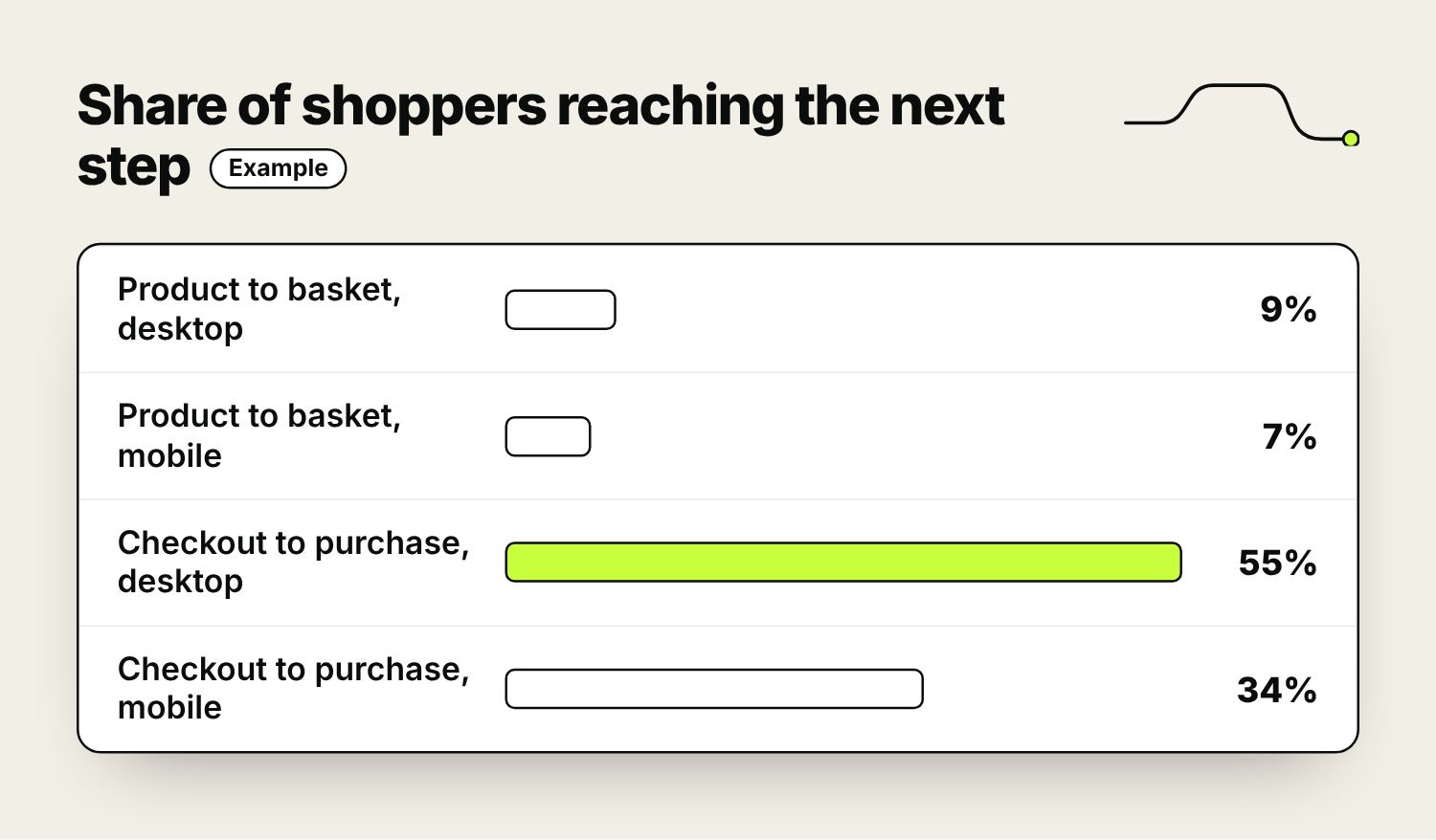
In the example above, phones keep up on the product page but fall well behind once people start checkout, so the checkout is the place to look first. Then watch session recordings of mobile visits at that step. Microsoft Clarity is free and flags rage clicks (repeated angry taps) and dead clicks (taps on things that don’t respond), a quick way to find a broken button or a hidden field.
Product pages on a small screen
On a phone people see one part of the page at a time, so the order matters.
Photos
Let people swipe through images and pinch to zoom. Make the first image show the whole product clearly, then close-ups and the product in use. Short videos should play only when tapped, with sound off by default.
Choosing a size or colour
Show sizes and colours as tappable buttons rather than dropdown menus, which take two taps and hide the options. Mark sold-out sizes clearly instead of removing them, and update the price and photos when someone picks a different option. Open the size guide in a panel over the page, so people don’t lose their place.
What sits near the button
Put the price, delivery cost, delivery time and stock status within reach of the add-to-basket button. Put the details people check most for your products (sizing for clothes, dimensions for furniture, compatibility for parts) high on the page. Fold the longer description and care instructions into expandable sections.
After adding to basket
A basket drawer that slides in, confirms what was added and offers a checkout button works well on a phone. Avoid full-screen pop-ups pushing other products at that moment; people tend to close them and lose track of what they were doing.
Collection pages, filters and search
On category pages with more than a screen or two of products, filters decide whether a phone shopper finds the right item or gives up.
- Keep the filter and sort buttons at the top of the product list, and keep them reachable as people scroll.
- Open filters in a full-height panel. Show the number of matching products on the button (“Show 24 products”) so people know what they’ll get before closing it.
- Show applied filters as small labels above the products, each with a cross to remove it.
- Two products per row usually works on a phone. Make sure the price is visible on every product card.
- Whether you use pages, a “load more” button or infinite scroll, check that the back button returns people to the same spot in the list after they’ve looked at a product. Being sent back to the top of a long list after every product is enough to make people give up.
On a large catalogue, show the search box open at the top of the page on mobile rather than hiding it behind an icon. Our guide to ecommerce site search covers how to make the results worth using.
Checkout and wallet payments
Wallets
Apple Pay, Google Pay and PayPal let people pay with a fingerprint, face scan or saved details instead of typing a card number and address. Shopify stores also have Shop Pay. Most payment providers can show these as express buttons on the product page and in the basket, where they save the most effort, as well as at checkout.
Each wallet only appears on devices and browsers that support it: Apple Pay on Apple devices, and Google Pay mostly on Android phones and in Chrome. That means you need to test on both an iPhone and an Android phone to see what your customers see.
Typing
For people paying by card, every field is typed with a thumb. The fixes are mostly in the code:
- Use the correct autocomplete settings on each field (for example “email”, “postal-code” and “cc-number”), so the phone can fill in saved details.
- Bring up the number pad for card numbers and phone numbers.
- Offer postcode lookup, and keep the form to a single column.
- Show errors next to the field as soon as it’s completed, not after the whole form is submitted.
- Check that the on-screen keyboard doesn’t cover the field being typed in or the pay button.
A large empty discount code box sends some people off to search for codes. A small “Add a discount code” link that opens the field does the same job with less distraction.
Bank approval
Under Strong Customer Authentication, many UK card payments need approving, often in the customer’s banking app. On a phone that means leaving your site, approving the payment and coming back. Test it with a real card: the shopper should land on the order confirmation page, and if they cancel or the approval fails, their basket should still be there.
Speed on mobile data
PageSpeed Insights shows two sets of results for each page. The top section, when your site has enough traffic, is real visitors’ experience collected by Chrome. The lab test below it is a simulated run on a mid-range phone. Base decisions on the real-visitor data, and use Search Console’s Core Web Vitals report to see which page templates (product, collection, basket) have problems.
On shops, slow mobile pages usually come from a few places:
- The main product image set to lazy-load. Images further down should load lazily, but the first one should load straight away.
- Images sent at desktop size to phones. Your theme should serve smaller versions to smaller screens.
- Apps for reviews, upsells, chat, pop-ups and tracking that each add code to every page. List every app and script, remove the ones nobody uses, and ask whether the rest need to load on every page.
- Promo bars and cookie banners that appear late and push the page down while someone is about to tap.
- Heavy scripts that make size buttons and the add-to-basket button slow to respond to a tap.
Testing on real phones
Browser tools that shrink your screen to phone size are useful for checking layout, but they don’t behave like a real phone on mobile data. Google also retired Search Console’s Mobile Usability report in late 2023, so nothing will warn you automatically about mobile problems. You need to check yourself.
Keep two test phones: a recent iPhone and a mid-range Android phone a couple of years old. If you can’t, a real-device testing service such as BrowserStack lets you run your shop on many phone models remotely. Turn wifi off and run through the full journey:
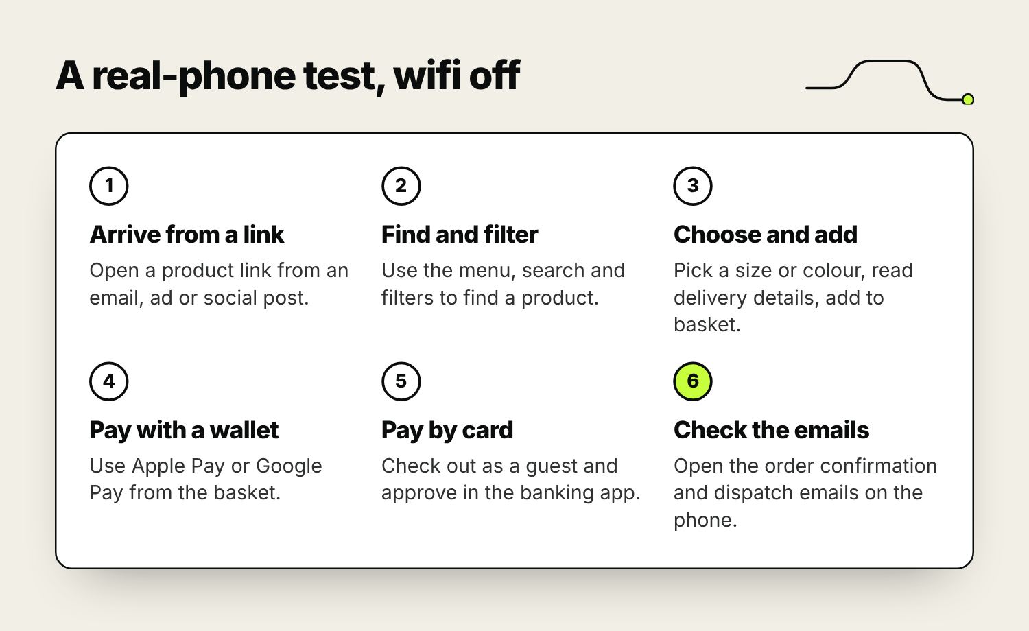
Run part of the test inside the Instagram and Facebook apps too. People who tap an ad or a post there open your shop in the app’s own browser, where they’re often not signed in to anything and some wallet buttons may not appear. If you spend on paid social, that’s where much of your mobile traffic first sees the shop. Repeat with your phone’s text size turned up, which many customers use, and check nothing overlaps or gets cut off.
Repeat the full test after every theme update, new app or checkout change. If you’re planning a rebuild, our website design service designs and tests ecommerce sites on phones first.
Frequently asked questions
What is ecommerce mobile optimisation?
It’s making an online shop as easy to use on a phone as on a computer: product pages that answer questions on a small screen, filters that work with a thumb, a checkout that needs little typing, fast pages on mobile data, and regular testing on real phones.
Why is my mobile conversion rate lower than desktop?
Partly because many people browse on a phone and buy later on a computer. To find real problems, compare each step of the funnel by device in GA4. If phones fall much further behind at one step, such as checkout, watch mobile session recordings of that step to see what goes wrong.
How do I test my online shop on mobile?
Use a real iPhone and a mid-range Android phone on mobile data, or a real-device testing service. Go through the whole journey from arriving on an ad link to receiving the order email, including paying with a wallet and with a card that needs bank approval. Repeat inside the Instagram and Facebook in-app browsers.
Should I add Apple Pay and Google Pay to my shop?
For most shops, yes. They let mobile shoppers pay without typing card and address details. Most ecommerce platforms and payment providers support them, and they help most when shown on the product page and basket as well as at checkout.
Does mobile optimisation affect SEO?
Yes. Google mainly uses the mobile version of a site to decide rankings, and it uses real visitors’ page experience data. A shop that’s fast and easy to use on a phone is better placed in search as well as more likely to turn visits into sales.
Do I need a mobile app for my online shop?
Most small and medium shops don’t. A well-built mobile site serves every visitor without a download. An app tends to make sense only when you have a large base of loyal customers who buy often and would use features like saved lists and push notifications.

Founder of The Pursuit Agency in Swindon. He has worked in SEO for fifteen-odd years and leads the agency's SEO and Google Ads work for owner-led businesses across the UK.